
Conversion fixes tend to arrive in the same order. First a countdown timer. Then a ‘selling fast’ badge. Then a popup offering 10% off for an email address. When none of it moves the numbers, someone suggests making the button bigger.

Every one of those tactics assumes the visitor has already decided the page is for them and only needs a push. Many haven’t. They’re still on the question everyone asks when they land somewhere new: is this for me?
Until that’s answered, pressure has nothing to push against.
The first question is always the same
Research by Nielsen Norman Group (NN/g) on information foraging describes people weighing how likely a page is to give them what they need against the effort of finding out. On arrival, they judge by the obvious cues: the headline, the images and whatever is visible without scrolling. If those point somewhere else, they go.
Drawing on a large Microsoft Research study of page dwell times, Jakob Nielsen’s summary was blunt: “Users often leave Web pages in 10–20 seconds, but pages with a clear value proposition can hold people’s attention for much longer.” The analysis dates from 2011, so treat the numbers loosely. The lesson holds: the first screen has to earn the next thirty seconds.
NN/g’s hierarchy of trust turns the same idea into a sequence. The bottom level is “Baseline relevance and trust that needs can be met”, and the visitor’s question there is “Could this site help me accomplish my goal?” Signing up, paying and subscribing all sit higher. The guidance is direct:
“Don’t make demands at higher levels of commitment until you’ve addressed all the trust needs at the inferior levels.”
A countdown timer is a demand. It asks for a decision now. Show it to someone who hasn’t settled the first question and you’re asking a stranger to commit.
Pressure can’t fix irrelevance
Urgency only works on people who already want the thing. For everyone else it’s noise, and it makes an off-target page feel even more off-target.
Baymard Institute’s testing shows how conversion features can backfire in the wrong context. Put a visible coupon field in checkout and “once users notice the coupon field, they will often feel like they are overpaying.” Unprompted live chat is “perceived as annoying and distracting”, yet the same chat helps someone with a real question. The feature isn’t the problem. The timing and relevance are.
There’s a legal edge in the UK, too. Falsely claiming an offer is only available for a limited time is one of the banned practices under the Digital Markets, Competition and Consumers Act 2024. The Competition and Markets Authority’s guidance uses the example of a countdown clock that restarts when it hits zero. Real deadlines are fine. Invented ones are a liability.
Where relevance leaks
Imagine a UK garden furniture retailer running an end-of-season sale. The homepage hero shows a rattan corner sofa, ‘Up to 40% off. Ends Sunday.’, a countdown timer and a ‘selling fast’ badge. Eight seconds in, a newsletter popup covers half the screen.
Now picture three people arriving:
- A homeowner in Leeds clicks an email about parasols. She lands on a sofa and has to hunt for the thing she was promised.
- A landscape gardener wants trade pricing on six dining sets for a client. Everything on screen is written for consumers, with no hint that the retailer sells to trade at all.
- A shopper in Dublin wants to know whether the retailer delivers to Ireland. The page doesn’t say, and nothing on it suggests the answer is worth digging for.
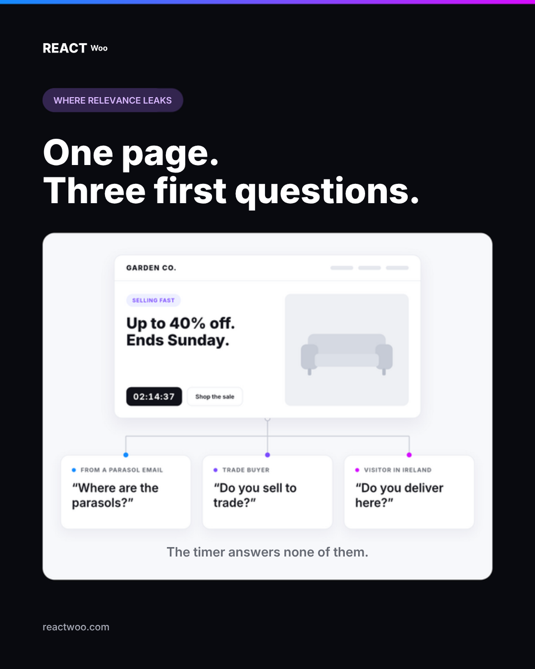
The timer does nothing for any of them. Each has a different version of ‘is this for me?’, and the page answers none.
In practice, relevance tends to leak in four ways:
- Arrival mismatch. The ad, email or post made a promise the landing page doesn’t visibly keep. Google’s advice to advertisers puts it plainly: “When someone clicks on your ad, they expect to land on a page that’s relevant to what they saw in your ad. If they don’t immediately find what they expect, they’re more likely to leave.”
- Audience mismatch. The copy speaks to the wrong group, or leans on terms only insiders use. NN/g notes that jargon and branded language can leave even accurate labels with weak information scent.
- Market mismatch. Offers, delivery areas or terms that don’t apply where the visitor is, or that only surface late.
- Misleading scent. A section that looks like exactly the right place but isn’t. In one of NN/g’s e-commerce studies, shoppers looked for baby car seats in the automotive section, found none and assumed the site didn’t sell them. The seats were elsewhere, and nothing pointed to them. NN/g’s standard fix is a cross-reference.
Answer the first question first
Write the first screen for the visitor, not the brand
Hide everything below the first screen and show it to someone who doesn’t know the business. Can they say what it is, who it’s for and whether it applies to them? If the page relies on a big lifestyle image and a slogan, probably not. NN/g warns about landing pages with “very little text and a big image on the first screenful”.
Say plainly who it’s for
‘Garden furniture for homes and holiday lets’ tells the landscape gardener more than ‘Outdoor living, reimagined’. A single line such as ‘Buying for clients? See trade pricing’ lets a whole segment qualify itself without getting in anyone else’s way.
Put qualifying details where the decision happens
Where you deliver, who can buy and what an offer excludes aren’t small print. They’re relevance information. If a promotion only covers some markets or some products, say so next to the promotion, not on the terms page.
Keep the promise from the click
Check your top ads, emails and social posts against the pages they point to. If the headline on arrival doesn’t echo what was clicked, fix the page or the link before you touch the button.
Then persuade, honestly
Once someone knows they’re in the right place, proof and urgency have something to work with. Reviews, a genuine deadline or truly limited stock can help an interested visitor reach a decision. Order matters more than volume.
One page. Several first questions.
The garden furniture example hides a harder problem. No hero can say everything, and the right answer to ‘is this for me?’ depends on who’s asking. The Leeds homeowner wants parasols, the gardener wants trade terms, the Dublin shopper wants to know you deliver.
NN/g’s advice is to optimise each page for its top task. That’s the right start, and for plenty of sites it’s enough. When a few distinct groups arrive with distinct questions, though, one static page forces a compromise. You can clone a page for every audience and live with the upkeep. Or you can adapt only the parts that decide relevance, using context you already have: where the visitor is, how they arrived and what device they’re on.
Either way, the default version deserves the most care. It’s what everyone without a specific match sees, so it has to answer the first question well on its own.
Change the part that answers ‘is this for me?’
ReactWoo Geo lets WordPress sites adapt the parts of a page that decide relevance, such as offers, calls to action, banners and local details, while the rest stays as it is. With Geo Core (free), you can show the Dublin shopper delivery details for Ireland and keep a default for everyone else. Geo Core Pro adds campaign, referral, device and audience conditions, combined with AND/OR logic, so the visitor from your parasol email and the visitor from your trade campaign don’t have to see the same first screen.
The takeaway
Before you add another nudge, ask a colder question: in the first ten seconds, could this visitor tell the page is for them? If not, no timer, badge or popup will rescue it. Make relevance obvious, then make your case. Persuasion works best on people who already know they’re in the right place.