
Open a typical product page and count the buttons that look like buttons. Add to basket. Buy now. Add to wishlist. Compare. Book a demo. Sign up for 10% off. Each one is the same size, the same colour, and equally sure of itself.
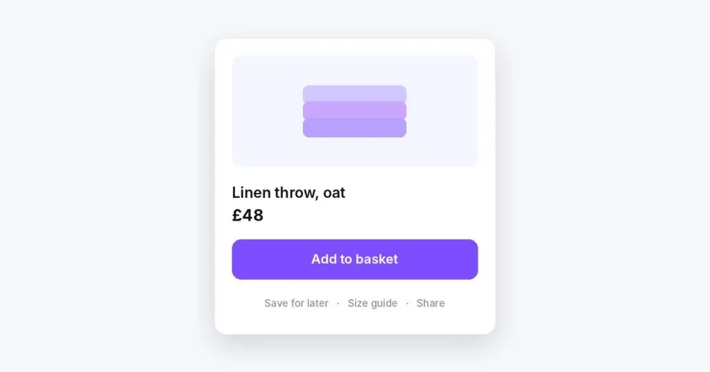
Nobody designed that. It accumulated. Marketing wanted the newsletter, sales wanted the demo, a plugin added a wishlist, and every request was reasonable on its own. The result is a screen that asks the shopper to decide which of your goals matters most. That is your job, not theirs.
Equal weight is a decision you have handed over
Every option on a screen is a small question: is this the one I want? Hick’s Law, as summarised on Laws of UX, puts it simply: “The time it takes to make a decision increases with the number and complexity of choices.” The same page suggests “highlighting recommended options” to avoid overwhelming people.
That does not mean a shopper freezes in front of five buttons. Most will pick something. But they spend attention working out what the page is for, and attention is the thing a product page is short of. Someone who came to buy a throw should not have to rule out a demo booking first.
The quieter cost is doubt. When “Buy now” and “Add to basket” look identical, people wonder what the difference is, and whether one of them skips a step they wanted. A page that cannot say what matters most rarely feels confident about anything else.

Every screen has one job
Before touching colour or size, write down the single action this screen exists for. One, not a ranked list.
- A product page is for adding the item to the basket.
- A basket is for going to checkout.
- A pricing page is for choosing a plan.
- A landing page from an ad is for the thing the ad promised.
Everything else is secondary. Secondary does not mean useless. A size guide matters. Saving for later matters to someone who is not ready. They just should not compete with the reason the page exists.
If you cannot pick one action, that is the finding. The page is probably doing two jobs, and it may need to become two pages or two steps.
Let the rest recede
Once you know the main action, the craft is visual hierarchy. Nielsen Norman Group’s definition of visual hierarchy (Kelley Gordon, January 2021) describes it as guiding the eye “to consume each design element in the order of intended importance”, using colour and contrast, scale, and grouping. Three levers are enough.
Contrast. Give the main action the only saturated fill on the screen. Secondary actions become outlined buttons or plain text links in a quieter colour. The NN/g piece puts the failure mode plainly: “If everything is contrasted, then nothing stands out.”
Size. Make the main button the largest interactive element in its area, full width on mobile if that suits the layout. Secondary actions can be smaller without becoming hard to tap.
Space and grouping. Put room around the main action. Group the secondary options together, below or beside it, so they read as one set of “other things you can do” rather than four rivals. The same article notes that an element with more space around it “will receive more attention”.
Then do the squint test the article describes: blur the screen, or step back from it. The thing that still stands out should be the thing the screen is for. If it is the discount banner, the banner is winning.
Receding is not hiding
There is a lazy version of this advice, and it causes its own problems. Do not delete the size guide, bury delivery information in a tab, or turn every secondary action into an unlabelled icon. People who need those things will look for them, and they should find them where they expect.
The test is not “how few things are on the page”. It is “does the next step announce itself, and are the other options there for the people who want them”. A quiet text link labelled “Save for later” passes. A heart icon with no label, floating in a corner, may not.
It also helps to be wary of two main buttons. “Buy now” next to “Add to basket” is a common example. If both genuinely serve different shoppers, keep one as the main action and make the other clearly secondary. Pick based on what most of your shoppers do, not on which one the business would prefer.
A quick pass for your busiest page
Take the page that gets the most traffic and work through it.
- Name the one action the page is for. Write it down.
- Count everything styled as a primary button. If the answer is more than one in the same area, choose.
- Restyle the rest as secondary buttons or text links, and group them.
- Check that every secondary action still has a clear text label.
- Squint. If something other than the main action jumps out first, turn it down.
- Look at the mobile version, where the competition for space is worse and a sticky banner can sit right on top of the button that matters.
Popups, chat bubbles and cookie notices count too. They are all asking for the same attention as the main action, often at the moment it matters most.
The takeaway
A screen with one obvious next step is not less helpful. It has done the thinking so the shopper does not have to. Decide what each page is for, make that action the loudest thing on it, and keep everything else close by, clearly labelled, and quiet.