
The lamp looked reasonable. The shopper added it, reached the shipping step, and met a delivery charge they had not been told about. They did not object to the price of the lamp. They objected to a different total.
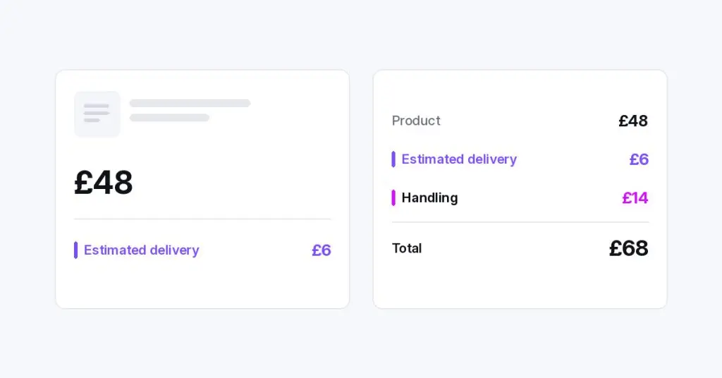
That is the abandonment worth fixing before the busy season. Not a prettier payment step. An earlier, truer cost.
They agreed to one total. Checkout offered another.
Cart abandonment is a blunt number. Baymard’s list of cart abandonment statistics, last updated 22 September 2025, puts the average of 50 published studies at 70.22%. Much of that is not a broken checkout. In the same write-up, 42% of US online shoppers in the latest quantitative study had abandoned a cart because they were “just browsing / not ready to buy”. Comparing and saving items will not be designed away.
Baymard treats the other reasons as issues that can be resolved, many of them in the design of the flow. The largest on that list is extra costs that were too high, covering shipping, tax and fees, at 40%. Slow delivery is 20%. Not being able to see or calculate the total up front is 12%. Some people leave because the extra is too much. Others leave because they could not see it in time. Either way, the number they decided on was not the number they were asked to pay.
An older Baymard page, UX statistics from March 2022, prints different percentages for these reasons. This article uses the September 2025 list only.
The sum starts on the product page
People do not wait for checkout to care about delivery. In Baymard’s product-page research, published by Christian Holst on 20 June 2017, 64% of users looked for shipping costs on the product page before they would add the item. The same piece reported that 43% of sites in that benchmark showed neither a shipping cost nor a calculator there. Treat that as established testing, not as a new survey. Missing it means starting checkout just to learn the price.
Holst quotes a participant on a kitchen-appliance page: “Price now is important, but then shipping price is too. So if I’m paying $349 for it and buying it online, am I paying $50 more in shipping? And, I’d like to know that before I’m in the checkout.”
How much it matters depends on the product. Delivery that is a large slice of a small price makes people hesitate. A small slice of a large price is easier to accept. A handling fee on something heavy can reverse that. So can an international order, where shoppers already expect the cost to differ from shop to shop.
The figure does a second job. It is how people judge a free-delivery threshold, and whether collecting in person is worth the trip. Without a home-delivery number, both are slogans.

A charge that arrives late is a different product
Picture a homeware shop in Sheffield. The product page for a ceramic lamp shows the lamp, the size and the price, and nothing about delivery. The cart repeats that price. The shopper has agreed twice.
At shipping, the lamp is oversized. A delivery charge appears that is large enough to change the decision, and a code from last week’s email does not apply to that address. They are no longer judging the lamp. They are judging a new total, on a page that asks for a card. It does not feel like “delivery was expensive”. It feels like the shop changed the price, and might change it again.
A second visitor, sending the lamp to Ireland as a gift, sees the same product page. The delivery cost is not the same. If the page never says so, the surprise waits until the address is typed. A softer line on the payment step will not repair that. A new number does the most damage there, because it arrives after the work.
Put the cost where the decision is made
Say it on the product page, even as an estimate. Baymard’s testing ranked a few patterns, from stronger to weaker. If you charge a flat rate, show the lowest rate someone can actually get. Next in that ranking was an estimate from the visitor’s approximate location, with the place named in the label. A signed-in customer’s previous address came after that. If you cannot pick one number, show a range and say it depends on destination. A range is weaker than a single figure. It still beats “calculated at checkout”, which only tells people to come back later.
Label the assumption. “Estimated delivery to South Yorkshire” confirms the figure for a local shopper and warns everyone else. Baymard found that this helped both groups. Let people change the place before they commit. A sentence is enough when delivery is always free. Heavy or oversized goods need the cost where it can decide the purchase, and a free-delivery threshold belongs next to the cost, not on its own.
Repeat the full cost in the cart, before the form. Show shipping, fees and, where you charge it, tax, or say plainly what the estimate leaves out. Put the free-delivery threshold in the order summary, not on a distant banner.
Do not add a new charge at review or payment. A handling fee, a rural surcharge, a fee for some countries only: if you will take it, it belongs in the cart. A new line on the review step feels like a penalty for getting that far.
Keep the words and the charge in step. A product page that promises one delivery cost, and a checkout that charges another, only moves the surprise earlier. If a coupon works in some countries only, do not show it as though it works everywhere. If a shipping method is not offered to a market, do not let that visit’s product page imply that it is.
This does not need a new checkout skin. The cost has to be knowable when the shopper chooses, and stable after that.
When the cost depends on the country
One delivery line for every visitor is honest only when every visitor pays the same. Often they do not. Delivery, a cart fee and a coupon can depend on the country, while the product page is one template. Silence, or the home-market figure shown to everyone, misinforms both the Sheffield order and the Ireland order. One of them finds out in checkout.
Do the general work first: an estimate, a label, a way to change the destination, and a cart that repeats the total. Only then adapt the message by country, without cloning the product page and without a promise checkout will break.
Show the delivery cost that applies to this visit
ReactWoo Geo is one way to stop a single product page telling every country the same delivery story.
With Geo Core (free), you show or hide sections, banners, offers, calls to action and local details by country. A delivery note for one market can sit beside the price, and a different note, or none, can apply somewhere else. If the country cannot be detected, or no rule matches, a sensible default stays visible. Geo Core does not calculate a carrier rate, display tax, or change the currency.
Geo Commerce is the WooCommerce add-on, and it needs Geo Core. Country-based rules do not need Geo Core Pro. It applies country-based cart fees, and it can restrict which shipping rates and which coupons are eligible, so checkout does not offer a fee or a delivery option that does not apply. You can preview the product page, the cart and checkout before the rule is published. If no commerce rule matches, the default catalogue remains. It does not switch payment gateways.
Used together, the job is narrow. The note on the product page and the charge in the cart should describe the same country. A banner that checkout then contradicts is not relevance. It is an earlier surprise.
The takeaway
People can accept a delivery cost. They struggle to accept a different total from the one they decided on. Baymard’s September 2025 list is a reason to inspect your own checkout, not a forecast of it: extra costs were the largest resolvable reason recorded, and a further group left because they could not see the total in time.
Put an honest estimate on the product page, and name what it assumes. Repeat it in the cart, including fees you already know you will charge. Do not add a new one at the last step. Where the cost changes by country, change the message with it, and make the charge agree. The shopper is not abandoning the price. They are abandoning the moment it moved.